Reflection
Strengthening a journaling product through a scalable design system and focused product improvements.
Project Overview
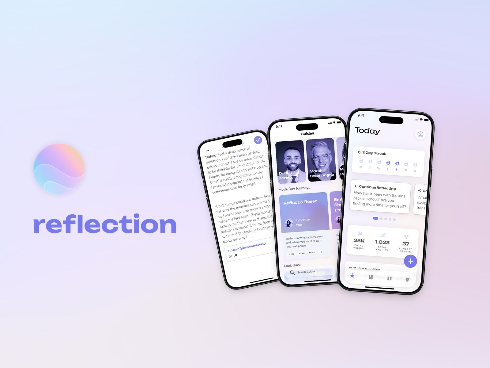
Reflection is a mobile journaling app that helps people capture their thoughts and build a regular reflection habit.
I joined the project after the core product had already been established. My initial responsibility was to improve and maintain its UI library. Over time, my contribution expanded into onboarding, paywalls, journaling, AI-assisted experiences, App Store screenshots, and app icon explorations.
Rather than redesigning the product from scratch, I focused on strengthening its foundation and improving selected experiences.
My Role
As a Freelance Product Designer, I worked directly with the founder and developer.
My responsibilities included:
- Restructuring the existing UI library
- Creating reusable components and product patterns
- Introducing variables and design tokens
- Defining clearer component naming
- Designing selected mobile features
- Supporting implementation with the developer
The Challenge
Reflection already had reusable UI assets, but most screens still relied on local components and one-off patterns.
This made common elements harder to reuse, update, and maintain consistently. The challenge was to build a stronger system while product development continued.
The system also needed to support light and dark themes, new product requirements, and clearer collaboration between design and development.
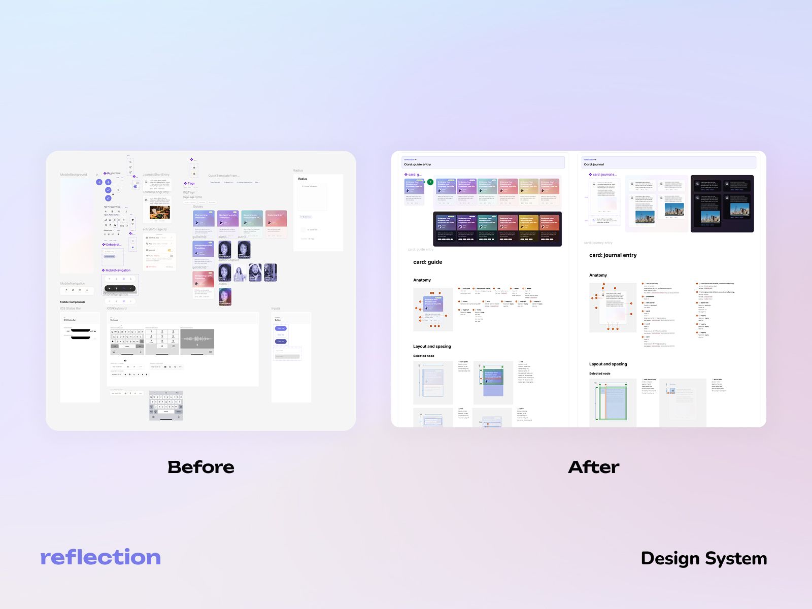
Building a Stronger Design Foundation
I reorganized the existing library into foundations, base components, and reusable product blocks.
The updated system included:
- Color variables and semantic tokens
- Typography and spacing foundations
- Light and dark theme support
- Component variants and interaction states
- Clearer naming patterns
- Reusable product-level blocks
I created components such as buttons, text fields, chips, toggles, alerts, tabs, navigation, cards, modals, bottom sheets, and other common mobile patterns.
The goal was not only to make the Figma file cleaner, but also to provide a more reliable foundation for product design and implementation.
Improving the Workspace
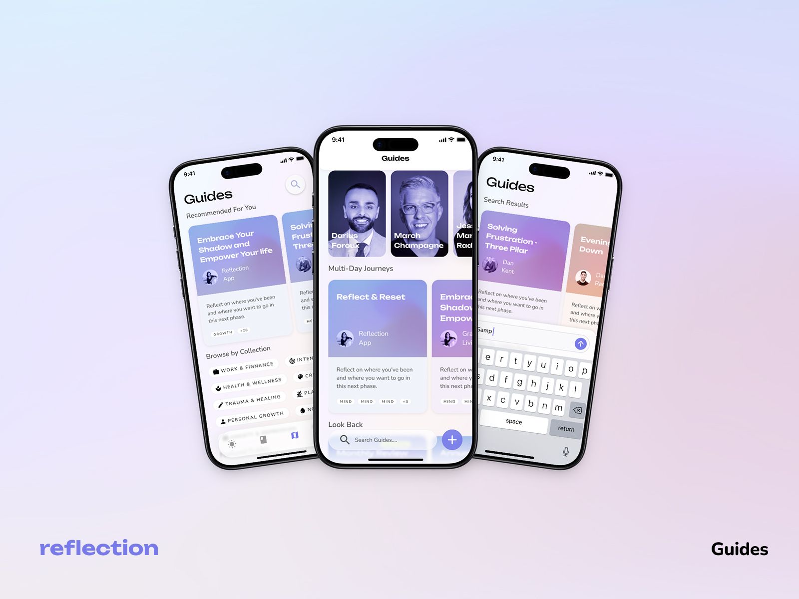
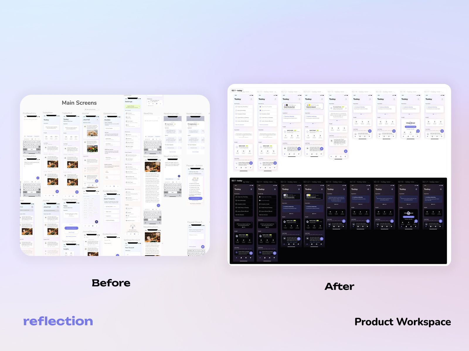
I also reorganized the design workspace around major product areas, including onboarding, home, journal, settings, search, AI voice, and coaching.
This made complete flows easier to find, review, and discuss with the developer. It also created a clearer separation between design explorations and final screens.
Selected Product Improvements
Onboarding Questionnaire
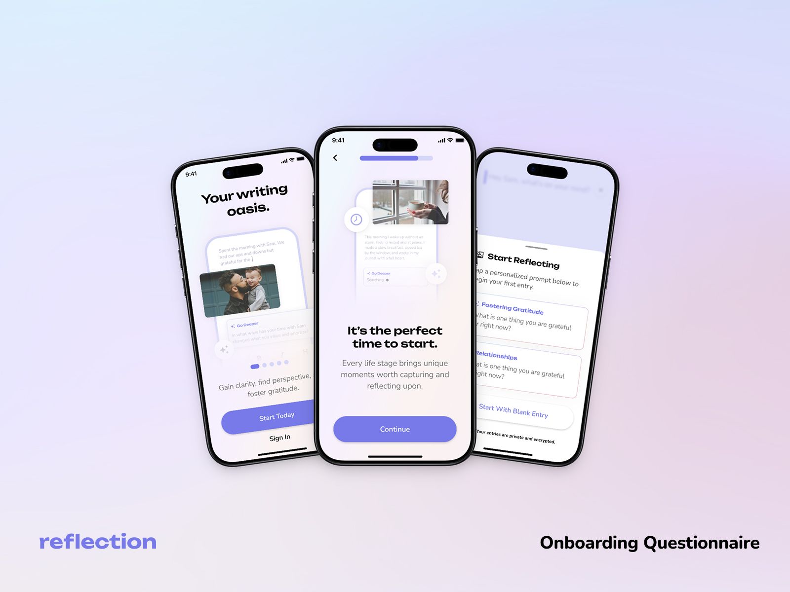
The founder wanted to refresh onboarding and make Reflection’s AI capabilities more visible.
I redesigned the flow using components from the updated design system. The experience introduced the product’s value and asked lightweight questions about the user’s goals and journaling experience.
The proposed design created a clearer and more modern introduction to Reflection across both light and dark themes.
New Paywall
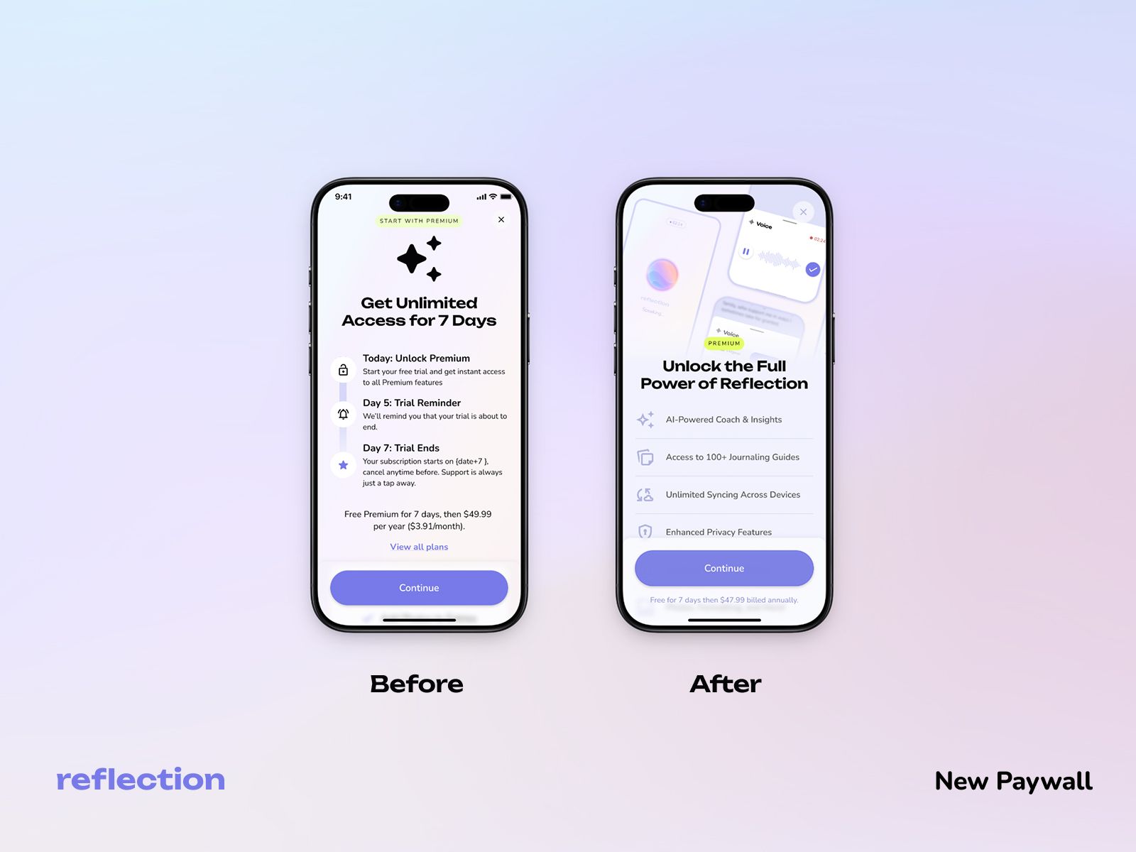
The existing paywall needed a visual refresh and a clearer way to communicate premium benefits.
I redesigned the content hierarchy, simplified the feature presentation, and introduced more product visuals and trust signals.
I also designed a Premium Scholarship concept based on a pay-what-you-can model, allowing users to select a more affordable annual price.
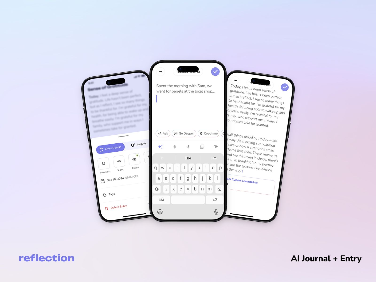
Journal + AI
I explored ways to make AI more useful within the core journal-writing experience.
The concept allowed users to:
- Receive writing prompts
- Refresh suggested questions
- Explore their answers more deeply
- View AI-generated summaries and insights
The main principle was to use AI to support reflection without replacing the user’s own writing.
Additional Contributions
I also contributed to improvements across:
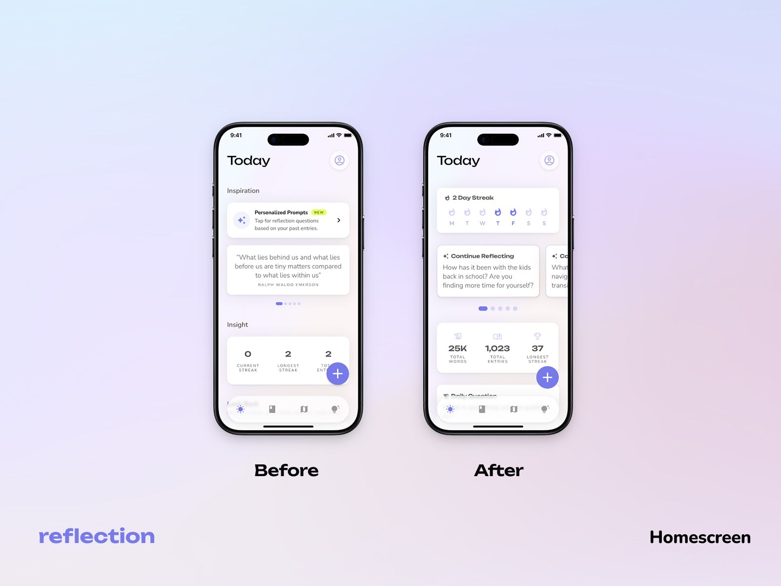
- Home Screen
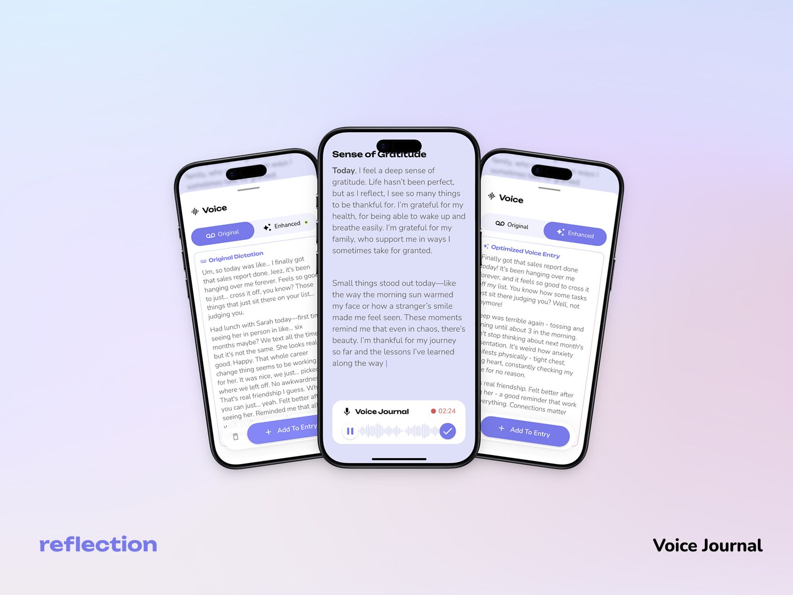
- Voice Journal
- App Store Screenshots
- App Icon
- Other smaller product and UI updates
Collaboration
I worked closely with the founder and developer throughout the project.
I supported implementation by clarifying component behavior, discussing interaction states, responding to technical constraints, and reviewing UI details.
This helped make the design system practical for real product work, not only organized inside Figma.
Outcome
The project created a stronger and more reusable design foundation for Reflection.
Shared components, variables, tokens, and clearer file organization reduced the need to recreate common UI patterns and improved consistency across product areas.
Because I was not involved in post-launch analytics, this case study focuses on my design contribution and the visible improvements in reuse, organization, and maintainability.
Reflection
This project showed me that meaningful product design does not always begin with a blank canvas.
My contribution was not one large redesign, but a series of connected improvements that strengthened both the product experience and the system behind it.
See Reflection in action
Explore the live experience or return to the full project archive.